New Google Logo
Google refresh their logo
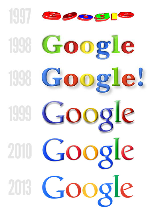
Google has changed alot over the last 17 years from the range of the products and services it provides to the evolution of their logo.
 When you compare Google’s logo way back in 1997 with its off the wall design and colour scheme and compare it to their logo released in 2013 the difference is very noticeable and definately a step in the right direction.
Google has also announced it will be changing its logo across all of its platforms, from the Google search engine on a web interface to tablet changing from their blue ‘g’ to a capitalised ‘G’ which is colour segmented with their traditonal colours. Even the favicon has seen a change (the little picture at the top of webpages next to the description) has changed to the above capitalised ‘G’.
With all these changes there are bound to be a few people complaining that they are not a fan of the new logo, most people don’t like change so there are inevitatably a few moans which is to be expected.
take a look at http://googleblog.blogspot.co.uk/2015/09/google-update.html for the background animation on how Google has evolved over the years.
The change of logo comes a month after a major recnstruction of the company was unveiled as Google is now owned by ‘Alphabet’ a holding company that was created by Google founders Sergey Brin and Larry Page to seperate their money making search engine company from the not so successful moon-shot projects such as robot cars, medical research and internet-delivering baloons.


